
(Used with permission. Source: http://cinnamonsolar.com/about-us/lease-borrow-or-buy/)
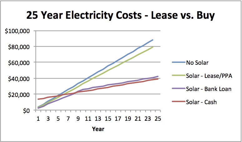
The graph above is one of my favorites about the residential solar industry. It explains exactly why residential solar leasing is dying.
It was created by Barry Cinnamon from Cinnamon Solar as a sales tool for his residential solar business in California. In the interview below, I chatted with Barry about why he created this graph, how he uses it for sales, and what it says about the changing residential solar industry.
If your job is focused on selling residential solar anywhere in the country, this interview will be useful. If you’re not already learning about solar loans, you need to start. Also, this graph is a piece of marketing genius that can help to re-frame the discussion of solar to help smaller installers compete against the big guys.
For those that have been in the solar industry for a while, you likely know Barry. He ran Akeena Solar and then Westinghouse Solar and he’s now back in the installation business with Cinnamon Solar and doing a great podcast on Renewable Energy World. (Here’s a heat pump interview Barry and I did on his podcast.) Barry really knows his stuff, explains complex subjects simply, and is looking to help the entire industry grow.
I’ve been chatting with Barry for a while before he sent me this amazing graph. We did an interview about Westinghouse Solar bringing installed costs down. After I wrote a guest article on Greentech Media about “Betting on the Decline of Residential Lease Financing” in 2013, he sent over the graph and, naturally, I wanted to talk with him about it.
On a policy level, states like Massachusetts have said they want to increase direct ownership and have come out with attractive solar loan options. On the private side, Admirals Bank, Hudson Clean Energy, and the national installers are getting on the bandwagon, too.
Here’s what we chatted about:
- The story of why Barry created the graph at Cinnamon Solar.
- Why Barry looked at just the “straight line” cash flows to compare all of the options. (Note: See below, there are a few additional reasons that make loans look even better and leases worse)
- What homeowners’ reactions to the graph tend to be. It creates the question “Why would I want to lease the system?” which is exactly what you want to talk to a customer about.
- The customer reaction that made Barry put this graph onto every single business card.
- Why there tend to be two types of residential solar customers: “solar investors” and “solar purchasers.”
- Whether the economics of this graph will change in the near future.
- What are the implications of what this graph represents for changing the industry over the next 3 years?
- How a change in the residential ITC will change this graph and impact leasing.
- How looking at the impact on the value of the home needs to be considered when looking at leasing versus owning. (Hint: Some analysis has solar adding ~$5,900 per kW installed if it’s owned)
- How leasing can hinder the sale of a home.
- How state incentives can help support the residential industry without the residential ITC.
- Barry’s 3 lessons learned on selling residential homeowners.
- What are the skills of a good salesperson? How to do you interview them?
- How Barry managed salespeople at Akeena and Westinghouse.
- Everyone always says referrals are the greatest things and what the business should be based on. What actions are required to make this happen on a tactical basis?
If you have any questions about this article, please leave them in the comment section.
I’m thinking about creating an Excel tool to calculate these four plots. If you’d like this, please let me know in the comments.


[…] Read More at Heatspring […]
Hi Chris, thanks for the podcast. I for one would be inteerested in an Excel tool to plot the graphs at the top of the page.
Also, I’m wondering if you know the title or more information on the University of Pennsylvania article you mentioned at the end of the show? The one that shows that giving credit to new customers via referral is more effective than paying a referrer? Thanks 🙂